Overview
When tasked with redesigning any user interface to improve its overall experience, my team and I set our sights on the Zara app—a platform we were personally familiar with, yet consistently frustrated by. The mission was clear: simplify the shopping experience for Zara’s customers, by blending an intuitive user experience with a sleek, modern interface.
Disclaimer: This project is not affiliated with Zara.com in anyway. This is a project done for Creative X club at Rutgers University.
My Role
I was responsible for the wireframing, UI design, and Prototyping.
Timeline
Fall semester, 2022
Tools
Figma, Miro, Zara application
The Team
Sakshi Malaviya, Anannya Bhagat, & Sophia Cruz

The Redesign
Proposal
With countless apps to choose from, my teammates and I landed on the Zara app after a unanimous agreement: shopping on the app was needlessly complicated and left us feeling frustrated more often than satisfied.
From its cluttered layout to its unintuitive navigation, the Zara app presented a prime opportunity for improvement. We envisioned a redesign that would not only resolve these pain points but also create a seamless, enjoyable shopping experience.
How Zara Looked Previously

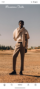
Home screen

Menu

Products page
User Research
Our redesign began with a foundational step: understanding the users. To ensure our redesign addressed real pain points, my team conducted user research, employing quantitative methods to survey opinions on the Zara app.
"It's not intuitive at all, the icons & images are all over the place. It also isn't easy to work out where the product information is." - user feedback.
Some of the Survey Responses


User Findings

Original Home Screen - Confusing Navigation
The app's UX is not intuitive for shoppers. The home screen can be swiped in multiple directions which makes it confusing. The icons such as search bar, menu, etc. appears on the bottom of the screen, unlike any other popular consumer app.

Original Menu - Cluttered
The absence of a hamburger menu led to scattered text and overwhelming visuals, while icons like the search bar and menu were awkwardly positioned at the bottom of the screen.

Original Shopping Screen - Inconsistent Visuals
The lack of clear instructions for different shopping sections complicates the user experience. Further, the different sizes of the displayed images makes it confusing to navigate.

Original Product Screen - Limited Feedback
No clear feedback about the product listed. The different sizes aren't properly visible and the varying pictures are hard to examine.
Design Process
Ideation
Before working on the wireframes, my team and I brainstormed ideas to make the app more user friendly while continuously referring back to our research.
For the design process we decided to focus on simplifying the features of the app. We primarily focused on the home screen, the product page, and the check-out page in order to ease the shopping experience of the app.
Wireframing
I was solely responsible for redesigning the hamburger menu as well it's slide-in & out, and pop-up page. I also designed the main product's page that had all the sections listed out in a clear-cut, easy to understand fashion.

UI Design
To bring our wireframes to life, I took charge of the UI design process. Drawing inspiration from Zara’s existing branding, I curated a color palette of black, gray, and beige to maintain consistency with the brand’s aesthetic while introducing a modern and minimalistic touch.
Key design updates included:
-
Onboarding Pages: I designed sleek, welcoming onboarding pages with smooth transitions to guide new users into the app seamlessly.
-
Consistent Branding: I ensured Zara’s logo remained visible across all pages, reinforcing brand identity throughout the user journey.
-
Redesigned Navigation: I restructured the navigation page to display product images in uniform sizes, eliminating confusion and creating a cohesive browsing experience.
Redesigned Screens
-
Home Screen: The original home screen showed just one model, offering limited category context. Our redesign created a dynamic display of Zara's clothing sections, providing users quick access to their preferred areas.
-
Menu: I redesigned the cluttered original menu into a side-sliding hamburger menu, organizing options into logical drop-down categories for and visually appealing navigation.
-
Products Page: I improved product pages by adding a carousel feature for easy swiping through images, while prominently displaying key details like size, color, and price, resulting in a more browsing experience.
1. Previous home page


1.Redesigned home page
3. Previous Products Screen


2. Previous Menu


2. Redesigned Menu
3. Previous Products Page


3. Redesigned Products Page
3. Redesigned Products Page
Prototyping
I was primarily responsible for prototyping the redesigned Zara application, I focused mainly on the motion design. Unlike the original application, which made the user swipe in multiple different directions, I ensured that the user was only able to swipe up & down to avoid confusion. While the rest of the app was kept in line with the original Zara app, I maintained similar pop-up screens and transitions from one screen to the next.

